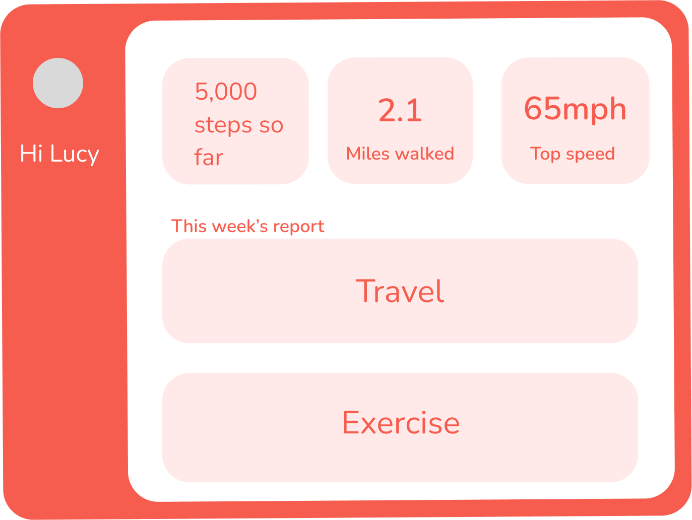
In today’s busy world, understanding personal movement patterns can help improve productivity, health, and time management. To explore this, I created a movement dashboard that visualises a week of my daily movements, including travel and physical activity. The goal was to analyse and present the data in an engaging and insightful way.
Over five weeks, I designed and developed the dashboard, focusing on data collection, visualisation design, user-friendly interactions, and prototyping.
For this project, I chose to track at my movements over a week. I used apps such as Apple Fitness and Life360 to help record my movement of the week.

Early sketches explored unique ways to present data, focusing on a home page with clickable options and a refined navigation bar.


Several wireframe iterations were created, experimenting with different visual layouts. I tested various concepts, such as circular designs and colour-coded dots for each day, but pivoted after feedback to focus on clearer, more practical layouts.

Developed mockups with a bold colour scheme, including deep shades of maroon, green, and orange to distinguish different data sets. I refined the layout by experimenting with gradients, font sizes, and colour contrasts to achieve a modern, cohesive design. I also introduced a clean, sans-serif font to enhance readability and a smoother navigation experience.
Content with my design, I created a fully interactive prototype in Figma to simulate the user experience. After this, I presented the design during a critique session, I received constructive feedback on colour contrasts, information hierarchy, and layout adjustment.
